Is it time for a Leafs makeover? Vote for a new team logo
Posted December 14, 2015 1:57 pm.
Last Updated December 14, 2015 8:43 pm.
This article is more than 5 years old.
The Toronto Maple Leafs are undergoing a major rebuilding process involving players and management, and apparently they’re planning on changing their logo as well.
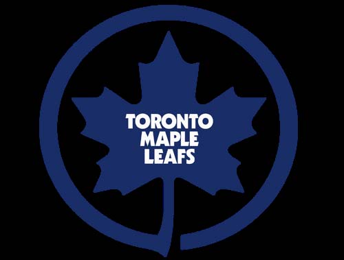
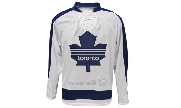
The team’s current logo has remained virtually unchanged since being unveiled in 1970. Only the font and the colouring has changed slightly. Prior to the 1970 version, the logo has mirrored the Canadian flag, featured a variety of veins, and had awkwardly lopsided versions in blue and green.

As much as die-hards don’t like change, the Leafs logo is looking a little dated. The font is very 1980s. And, let’s face it, it’s not like the team has won any Stanley Cups with the current incarnation, so it’s not like the franchise is turning its back on some kind of winning tradition.
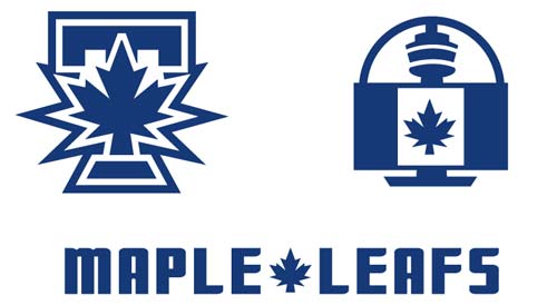
The good news is that there is no shortage of new logos already available online. We’ve collected some of the best (or worst?) for your perusal.

1. Leafs starburst
This one is definitely different, and not in a good way. Perhaps it reflects Toronto’s condo culture or the city’s affinity for Frank Gehry’s architecture, turning the traditional leaf into a series of art deco blocks of differing heights. The font is still the same, which is one of the core problems with the current logo. So it’s pretty unlikely we’ll see something like this.
Rating: 3/10
Toronto Maple Leafs – Brought to you by Air Canada
Air Canada would certainly endorse this version, as it’s essentially their logo painted blue with that old font dropped on the middle. But unless MLSE is considering being the first-ever NHL team to actually incorporate advertising in their logo, this one will probably go no further than Air Canada’s dreams.
Rating: 2/10
The Blue Leafs, now on TV
The logo on the left looks a lot like one of the alternative Blue Jays logos, the one with the jay wrapped around the capital T. The one on the left incorporates Toronto’s next-biggest icon – The CN Tower – which is an interesting approach, but using the actual Canadian flag in blue in front of it would probably cause riots across the country. And the base of the tower is just weird, almost making the flag look like a television set. So on the basis of confusion alone, it’s pretty unlikely these logos would get much consideration.
Rating: 3/10
The Adidas
Adidas may have something to say about this one, which takes the sport wear giant’s three vertical lines and implants them on the Maple Leaf. Could be fitting for those who feel the organization has flat-lined one too many times, but when it comes to originality it’s got all the appeal of a sweaty sneaker.
Rating: 2/10

Spirit104
The blue’s a bit brighter. The white’s a bit lighter. The Maple Leaf’s a bit smaller. What’s the point? Traditionalists may gave this one the nod because it doesn’t stray too far from the version they’ve grown accustomed to cursing at over the last few decades. Not much of an upgrade though, more or a sterilization.
Rating: 4/10
Smooth Operator
It’s pleasing to the eye. It blends tradition with a fresh new look. We may have a winner on our hands.
Rating: 7/10
Jagged Little Pill
We’ll give this one some points for shaking up the colour scheme while not straying too far into abstraction. The Leaf logo has a more jagged, elongated appearance that stands out nicely.
Rating: 5/10
The Grandaddy
The Leafs have one fighting major this season (Nazem Kadri). The truculence Brian Burke tried to bring to Toronto is long gone, and this sweater suits the kinder, gentler Leafs. It’s safe. It’s polite. It’s got no edge. It’s wimpy. You can picture you grandad wearing it.
Rating 2/10
Vote for your favourite in the poll below or at this mobile-friendly link.